Giving people clear instructions through recycling posters on what to do with the recyclable waste is critical for the success of your program and the health of our planet. The best way to disrupt the status quo of a non-effective recycling program is to use clear and impactful recycling posters and graphics.
 San-Francisco-based Tesla uses green for organics, black for landfill and blue for recycling.[/caption]
CleanRiver’s in-house graphics department designs and prints best-in-class recycling graphics. For a quote call 1-888-646-4246 or email solutions@cleanriver.com
*Study from Missouri University Science and Technology facilities
Here’s 8 things you should know about recycling posters
1. Use images (not just text).
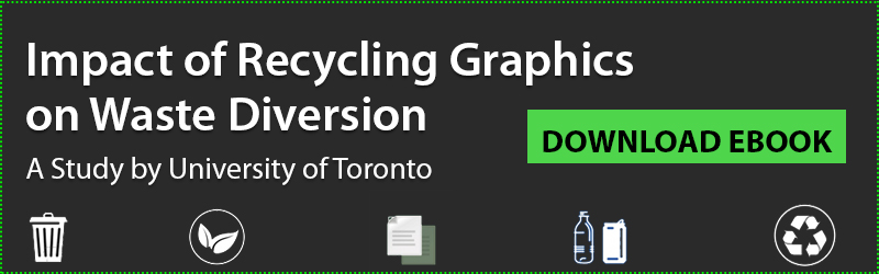
A recent study on recycling posters by the University of Toronto found that the addition of images to their graphics more than doubled their diversion rate. A high school in Toronto added recycling posters to their program and decreased their contamination rate by 72%.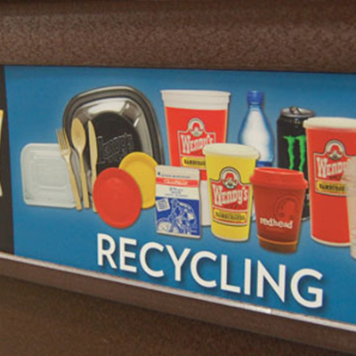
2. Use facility-specific images.
Many stadiums and convention centers are working with vendors to control the waste that’s brought into the facility. They are then able to use specific images on their recycling graphics to help people make the right choice. Using images of waste that's typical for your facility has a significant impact on your diversion and contamination rate. It’s easier for people to recognize which stream to toss their waste.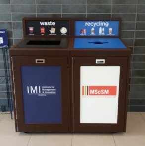
In the pilot study conducted at the University of Toronto Mississauga (UTM) the diversion rate increased by 163% after incorporating facility-specific waste images and text in recycling posters.
3. Keep consistent color-coding.
It’s a recycling best practice to keep consistent color-coding throughout your facility for each stream. There aren’t any standard colors for recycling streams but the popular choices are often black for waste, blue for recycling, green for compost and grey for confidential or white paper. Make sure you use the same colors in your graphics to help reinforce the connection and help people make the right choice. [caption id="attachment_2198" align="aligncenter" width="400"]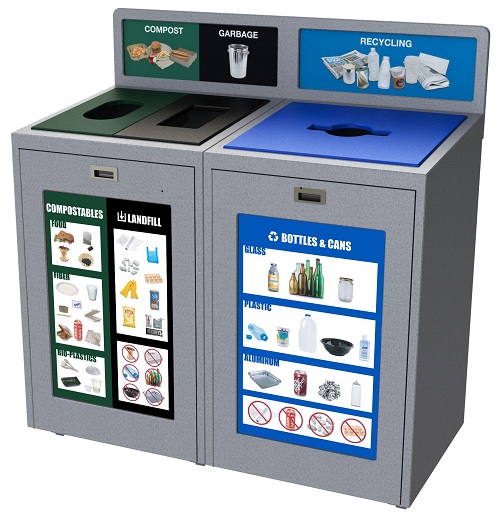 San-Francisco-based Tesla uses green for organics, black for landfill and blue for recycling.[/caption]
4. Keep it simple.
People only have about 2 seconds to make a decision as they approach a recycling container. If they’re overloaded with images it becomes overwhelming and the person will just toss their waste into the nearest opening. To avoid this scenario keep the number of images to a minimum. For example show one pop bottle, one glass bottle, one can and a juice container. Don’t show multiple versions of the same thing. [video_wrap][/video_wrap] Visual graphics help direct more waste into recycling – as much as 52% more than text-only signs!* *Study from Missouri University Science and Technology facilities5. Clearly visible.
This sounds obvious, but make sure you place recycling graphics where people can see them. Most popular choices are on the front of the container so you see it as you approach, on a backboard or next to the openings.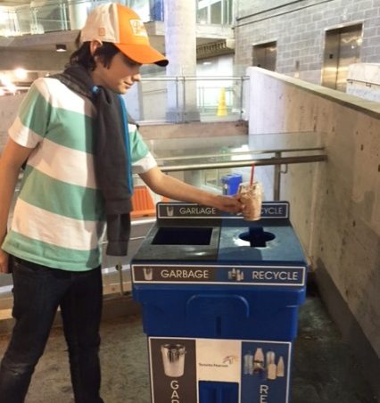
Toronto Pearson Airport uses clear visible graphics to tell you what’s recyclable.
6. Consistency is key.
It’s vital to ensure that all recycling labels throughout your facility or campus are consistent in the image, color and text. You need to help people make the right choice by developing patterns in their behavior. If you have a blue opening on a bin for paper, don’t have a blue opening for beverage container recycling in a different area. It causes confusion and generates distrust in the program. [gallery link="file" ids="11232,11211,11233"]Bentley University uses a variety of container styles depending on location and capacity requirements but keeps the recycling posters and stream colors consistent
7. Overcoming language barriers.
If your facility or campus includes a high percentage of people who speak a different language for example Spanish or French, remember to incorporate that into your recycling graphics to help them participate in your recycling program.8. Update your recycling graphics regularly.
Recycling programs are constantly changing. Whether it’s consumer driven or directed by Government or waste hauler mandates. Just remember to update your graphics whenever you make a change to help people adapt to the new behavior. With the addition of organics recycling in California and Metro Vancouver for example, it’s been vital to let people know to recycle their food scraps at work, school and in public spaces. To protect your investment purchase containers where the labels or graphics can easily be changed so that you can make updates whenever you need to.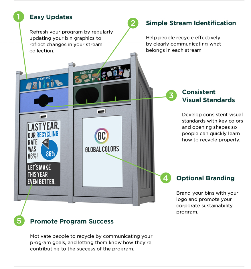 CleanRiver’s in-house graphics department designs and prints best-in-class recycling graphics. For a quote call 1-888-646-4246 or email solutions@cleanriver.com
*Study from Missouri University Science and Technology facilities
CleanRiver’s in-house graphics department designs and prints best-in-class recycling graphics. For a quote call 1-888-646-4246 or email solutions@cleanriver.com
*Study from Missouri University Science and Technology facilities