
Share
9 min read
Will a Recycling Bin Improve Recycling Rates?
The short answer is yes but only if the bin is designed and placed correctly. A bin alone does not change behavior. A bin in the right location, with the right color, the right lid aperture, the right signage, and paired with the right neighbor bins that combination changes behavior significantly. Here is what the science says, and what it means for your facility.
Only 21% of recyclable material in the U.S. is actually captured and recycled. The Recycling Partnership’s 2024 State of Recycling Report found that 76% of recyclables are lost at the household or point-of-disposal level meaning the single biggest opportunity to improve recycling outcomes is not at the sorting facility or the hauler, but at the moment a person decides where to put something.
That moment happens at the bin. And a growing body of peer-reviewed research including a comprehensive 2026 systematic review of waste bin behavior published in Environmental Psychology Research confirms that physical bin design has a measurable, significant impact on both recycling participation and contamination rates. The design variables that matter most are saliency, lid shape, color, signage, co-location with other bins, and proximity to users.
Here is a question-by-question breakdown of what works, grounded in research.
1. How Do I Reduce Contamination?
The $3.5–4 billion annual problem and how design solves it
Recycling contamination non-recyclable materials deposited in recycling bins costs an estimated $3.5 to $4 billion annually in the U.S. alone. That figure covers rejected loads, re-sorting costs, processing downtime, and landfill disposal fees for material that was supposed to be recycled. Approximately 25% of items placed in U.S. recycling bins are contaminants that don’t belong there. In some commercial settings, contamination rates reach as high as 25–30% without active management.
Contamination is primarily a design problem, not an attitude problem. Research consistently shows that most people want to recycle correctly a Keep America Beautiful consumer study found 80% of respondents said recycling in public spaces was important to them. The gap between intent and behavior is caused by ambiguity at the point of disposal: the wrong bin is just as easy to use as the right one.
The most effective contamination-reduction interventions are physical, not educational. Research from the 2026 systematic review found that specialized lid designs reduced contaminants in recycling bins by up to 94% compared to open-top bins in the same location. Las Vegas Clark County Schools implemented standardized bin labels and signage across their facilities and reduced contamination rates so significantly that they saved $6 million in trash hauling fees over two years. These outcomes are achieved through design, not campaigns.
The most impactful contamination-reduction design features, in order of effectiveness:
- →Aperture-specific lids that physically limit what can be deposited (covered in detail in Question 4)
- →Proscriptive signage “Do NOT put these items here” outperforms prescriptive “Put these items here” at reducing contamination (covered in Question 5)
- →Consistent color-coding that matches the community’s existing recycling cues (covered in Question 3)
- →Co-location of recycling with landfill bins so users are never forced to walk away to find an alternative (covered in Question 6)
- →Regular audits to identify which stations are generating contamination and address root causes specifically
2. What Bin Design Increases Recycling Participation?
Saliency · Proximity · Physical design parameters
The 2026 systematic review of waste bin design and observable recycling behavior the most comprehensive analysis of the field to date identified four physical design factors that consistently improve recycling participation: bin saliency, lid design, location and proximity, and signage. Of these, the review concluded that physical design parameters appear to be more important determinants of waste bin use than psychological interventions like messaging campaigns or normative appeals.
Saliency: The Bin Must Be Noticed
A bin that blends into its environment is a bin that gets ignored. Research shows that bins that stand out from their surroundings through distinct color, shape, or placement attract more use. This is called saliency. The most effective public space recycling bins use a color that people have already learned to associate with recycling (capturing both bottom-up attention from novelty and top-down attention from learned association), and are positioned where users will encounter them naturally during their existing movement patterns on a walking path, near a food area, or at a building exit.
Proximity: Closer Bins Drive Dramatically Higher Participation
A University of British Columbia study placed bins at three distances from residents’ suite doors in a central waste room, at the base of an elevator, and directly outside suite doors on each floor. Moving bins from the central location to suite doors increased recycling and composting rates by 141%. Adding compost bins on each floor rather than only on the ground floor increased composting rates by 70%, diverting 27 kilograms of compost per unit per year from landfill. The physical distance to a bin is one of the most powerful variables in recycling behavior.
A separate university campus study confirmed this: placing recycling bins in classrooms at the point of consumption substantially increased recycling compared to hallway bins. The same research found that manipulating the number of bins in common areas without changing their location produced no meaningful increase in recycling. Location is more powerful than quantity.
Key Research Finding
Physical design parameters lid shape, color, location, proximity are consistently more effective at changing recycling behavior than psychological interventions like awareness campaigns or normative messaging. Design the system so the right behavior is the easiest behavior, and most people will follow.
What Doesn’t Work: Normative Messaging on Bins
One consistent finding across multiple studies deserves attention: normative messages on waste bins statements like “do like me, it’s important to put your trash in the bin” sometimes produce a backlash effect, resulting in worse bin use than control bins with no message. The 2026 systematic review found this across several independent studies. The likely cause is that overloaded or moralistic messaging triggers reactance an adverse response that reduces people’s willingness to comply. The implication: design bins to make the right choice the easiest choice, rather than to lecture users about why they should make it.
3. Are Color-Coded Bins More Effective?
Yes with one critical condition
Color-coded bins are more effective than single-color or identically colored bins but the effectiveness depends entirely on whether the colors are consistent with what users have already learned to associate with each waste stream. Color functions as cognitive-load reduction: a blue bin becomes visual shorthand for “recyclables” faster than any sign can be read, particularly in high-traffic environments where users have limited attention and dwell time.
Research on color preference in waste bins found that blue recycling bins were recognized correctly by 91.86% of users and green organics bins by 80.5% even without reading signage. When bins are all the same color, confusion increases, contamination rises, and recycling rates fall. A university campus study replaced gray, identically colored trash and recycling bins with blue recycling bins before increasing their number or location the color change alone improved identification and participation.
The Standard Color System
| Color | Waste Stream | Notes |
|---|---|---|
| Blue | Recycling (paper, plastic, cans, glass) | Universal standard in North America; legally mandated in California (SB 1383) |
| Green | Organics / compost | Legally mandated in California; widely adopted across North America |
| Black or Gray | Landfill / general waste | Legally mandated in California; standard across most North American jurisdictions |
| Yellow | Plastics or mixed containers (varies by region) | Less standardized; confirm with local hauler before adopting |
| Red | Biohazard / landfill in some regions (Australia) | Never use red as a recycling color; OSHA regulates red for biohazard waste in healthcare |
The Critical Condition: Consistency
Color only works when it is consistent. A blue recycling bin in the lobby that becomes green in the break room and yellow in the car park breaks the learned association and forces users to re-evaluate at every disposal point. The EPA’s guidance for commercial buildings is explicit on this point: if your recycling bins are blue, composting is green, and trash is black keep the colors consistent throughout your entire program and building. Washington State codified this principle into law effective 2028, requiring standardized colors across all waste containers provided by haulers.
One important nuance from the research: color alone is necessary but not sufficient. A 2023 Los Angeles County study found that pictogram-enhanced bins increased correct sorting among limited-English-proficiency households by 37%, compared to just 12% for color-only bins. Color establishes recognition; signage and aperture design communicate what belongs inside. The two must work together.
4. What Lid Openings Work Best for Bottles, Cans, Paper, or Garbage?
Aperture design is the single most powerful contamination-reduction tool available
The shape of a bin’s opening is one of the most underappreciated variables in recycling program design and one of the most powerful. Research by Duffy and Verges, replicated across multiple settings and reviewed in the 2026 systematic review, found that specialized aperture lids increased recycling rates by 34% and reduced contaminants in recycling bins by 94% compared to open-top bins. The mechanism is simple: the physical shape of the opening makes it difficult or impossible to deposit the wrong type of material, removing the need for a user to make a judgment call at the point of disposal.
In that original Duffy and Verges study, three bins were arranged side by side labeled as Trash, Aluminum/Glass/Plastic, and Paper with some stations featuring shaped lids and others with open tops. The shaped lids worked so powerfully because they communicated the bin’s purpose through their form, not just through text. As one review described it: the shaped lids “shout their purpose simply by the look and shape of the bin.”
Aperture Design by Material Stream
| Material Stream | Recommended Aperture | Why It Works |
|---|---|---|
| Bottles & cans (beverage containers) | Small circular hole | 81% of users associate a circular opening with round beverage containers; physically prevents flat items from being inserted |
| Paper & cardboard | Narrow rectangular slot (2-inch wide slit) | 81% of users associate a narrow slit with newspaper/paper; forces cardboard to be flattened; prevents bags and bulky items from being inserted |
| General landfill waste | Large square or swing-flap opening | Accommodates full trash bags and bulky items; the large opening signals “everything else goes here” |
| Single-stream recycling (bottles, cans, and paper combined) | Saturn lid (slot + circle combined) | A rectangular slot with a circular hole in the center accommodates both flat paper and round beverage containers while still preventing bags and large items |
| Organics / food waste | Small swing-lid or sealed dome opening | Contains odors; prevents liquid spills; hands-free operation reduces contamination from wet hands and food residue |
The recommended practice from CleanRiver’s own contamination reduction guidance mirrors the research: a large square opening for general waste, a smaller circular opening for beverage containers, and a thin rectangular slot for paper products. This combination uses the physical form of each opening to do the sorting work before a user even reads the label.
5. Should Landfill and Recycling Bins Be Placed Together?
Yes always. This is one of the most consistent findings in the literature.
Placing a recycling bin next to a landfill bin is not just recommended it is essential. The EPA’s guidance for commercial buildings states it plainly: “it should be as easy to recycle as it is to throw something away.” Multiple research studies confirm what common sense suggests: when a user approaches a recycling bin and realizes they also have non-recyclable items to dispose of, if there is no landfill bin immediately beside it, one of two things happens they deposit everything in the recycling bin (contamination) or they walk away to find a trash can and deposit their recyclables there too (missed capture).
A study in Behavior and Social Issues found that bin proximity placing recycling bins closer to users and pairing them with landfill bins produced meaningful decreases in recyclable material being thrown in trash cans. When visual prompts were added to proximity-paired bins, the effect was slightly stronger than proximity alone.
The Predictable System Effect
Research on bin placement strategies for recycling identifies another benefit of consistent co-location: predictability. When bins are always placed together in the same configuration landfill on the left, recycling in the middle, organics on the right, for example users who encounter the system repeatedly stop having to think. The pattern becomes automatic. Inconsistent configurations force users to re-evaluate at every station, increasing cognitive load and error rates. Standardize the arrangement and maintain it across every location in the facility.
Co-Location Rule
Never place a recycling bin without a paired landfill bin within arm’s reach. Never place a landfill bin without a recycling bin beside it. The two belong together always. A landfill bin placed in isolation becomes the default receptacle for everything, including recyclables.
The Desk-Side Bin Problem
One of the most counterintuitive applications of this principle is the case of desk-side bins in open-plan offices. When employees have a large landfill bin at their desk and no immediately paired recycling bin, they default to using it for everything recyclables included because it is the path of least resistance. Research on centralized waste stations versus desk-side bins shows that removing desk-side landfill bins and redirecting users to centralized paired stations not only increases recycling but reduces contamination, because the act of walking to a station introduces a moment of deliberate decision-making that the desk-side bin eliminates.
6. How Do I Make Recycling Easier for Users?
Signage · Simplicity · System design
Making recycling easier is not about making it more forgiving it’s about removing every source of friction and ambiguity between a user’s intention to recycle and a correct disposal decision. The research points to three levers that reliably work: signage that tells users what NOT to put in the bin, visual labels that communicate without requiring comprehension, and system design that makes the correct choice the most convenient choice.
Use Proscriptive Signage, Not Just Prescriptive
A 2024 study published in the Journal of the Academy of Marketing Science found a surprising result: signs telling users what they CAN put in a recycling bin (“Recycle these items”) did not reduce contamination and sometimes increased over-recycling people’s enthusiasm about recycling led them to add borderline or incorrect items. Signs telling users what they CANNOT put in a recycling bin (“Do NOT recycle these items”) reliably reduced contamination. The mechanism is what researchers call schema-congruent vs. schema-incongruent information: proscriptive information about what not to recycle is unexpected in a recycling context, and that incongruity makes people pay more careful attention.
Practical application: your bin signage should include both a short accepted-items list and a clearly visible rejected-items list. The rejected-items list is the more powerful contamination-reduction tool. Show photographs of the most commonly mis-deposited items in your facility coffee cups with liquid, plastic bags, greasy pizza boxes rather than abstract categories.
Pictograms Outperform Text, Especially in Diverse Environments
A bin label showing a photograph of a soda can is understood almost instantly and works across language barriers. A label that says “Aluminum beverage containers” requires reading, comprehension, and a category match that takes longer and fails for users with limited literacy or English proficiency. Research from Resource Recycling found that over 85% of users correctly recognized soda cans, plastic bottles, and newspapers as recyclable when presented with word-based signage that used simple nouns but pictogram-based signage performed better still for diverse populations. The 2023 Los Angeles County study showed that pictogram-enhanced bins improved correct sorting by 37% among limited-English-proficiency households, versus 12% for color-only bins.
Best-practice signage combines: color-coded background matching the bin’s lid color, photographs of accepted items, photographs of rejected items, and minimal text using simple nouns rather than category descriptions. Mount signage at eye level, above or directly on the bin face, where it can be read before a user arrives at the station not just at the point of deposit.
Design the System, Not Just the Bin
The most important thing the research teaches is that recycling behavior is a systems problem, not an individual behavior problem. Most people want to recycle correctly. The gap between intention and action is caused by systems that make the wrong choice easy and the right choice unclear. Every design decision lid shape, color, signage, co-location, proximity, consistency either closes that gap or widens it.
reduction in contamination from aperture-specific lids
increase in recycling from proximity-optimized bin placement
saved in 2 years by one school district using standardized signage
The Design Checklist: Six Things Your Recycling Bins Must Get Right
| 1 | Saliency: The bin must be visually distinct from its surroundings and encountered naturally on users’ movement paths |
| 2 | Consistent color-coding: Blue for recycling, green for organics, black/gray for landfill applied uniformly across every bin in the facility |
| 3 | Aperture-specific lids: Circle for bottles and cans, narrow slot for paper, large square opening for landfill waste |
| 4 | Proscriptive + pictogram signage: Show what does NOT go in the bin, with photographs, mounted at eye level before users reach the station |
| 5 | Always co-located: Recycling and landfill bins must always be paired side by side never place one without the other |
| 6 | Proximity-optimized placement: Position bins at the point of waste generation, on natural walking paths, within 30 feet of any user at all times |
The evidence is clear: a well-designed recycling bin in the right location, with the right aperture, color, and signage, paired with its landfill companion produces measurably better outcomes than no bin, a poorly designed bin, or a well-designed bin in the wrong place. Recycling behavior is fundamentally a design challenge. Solve it with design.
Want bins designed to drive better recycling outcomes?
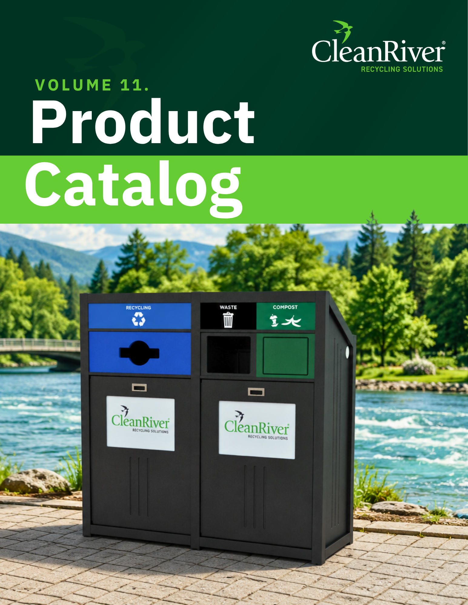
CleanRiver’s recycling stations are built around the design principles the research supports aperture lids, color-coding, signage integration, and co-location.