
Share
9 min read
How to Choose the Right Recycling Bin Signage: A Research-Backed Guide for Facilities Managers
Signage is not decoration. It is the primary behavior-change tool available at the moment of disposal, and it is far more powerful than most facilities managers realize. Rhode Island adopted standardized recycling labels statewide and saw a 20% increase in recycling levels through contamination reduction alone. Las Vegas Clark County Schools saved $6 million in hauling fees over two years with standardized bin labels. The research is unambiguous: the right signage changes behavior. The wrong signage makes things worse.
Most organizations approach recycling signage as an afterthought. They install bins, print generic labels from the internet, and wonder why contamination stays high. The problem is not that people don’t care about recycling. Research consistently shows that most people want to sort correctly. The problem is that most signage fails at the exact moment it is needed: when someone is standing in front of a bin for two seconds, holding an item, making a split-second decision.
Dozens of academic studies have examined what makes recycling signage work. The findings are specific and actionable. What wording to use, whether to show images or text, where to place signs, how to build a standardized station, and how to handle different environments all have research-backed answers that facilities managers can apply directly.
Here is what the research says, organized around the five questions facilities managers ask most often.
1. What Labels Should I Use on Recycling Bins?
Stream name, accepted items, rejected items, and nothing else
Effective bin labels communicate four things, in this order of priority: what stream this bin is for, what belongs in it, what does not belong in it, and how to prepare items before depositing them. That is the complete scope of a well-designed bin label. Everything else adds cognitive load without improving sorting accuracy.
The Four-Layer Label Framework
| Layer | Content | Example |
|---|---|---|
| 1. Stream name | Large, bold text identifying the stream; color-matched to the bin or lid | “RECYCLING” in large bold text on blue background |
| 2. Accepted items | 3 to 5 photographs or icons of the most common accepted items specific to this location | Photo of a plastic bottle, aluminum can, cardboard box, glass jar |
| 3. Rejected items | 2 to 3 photographs of the most commonly mis-deposited items at this specific location, shown with a red X or strikethrough | Photo of a coffee cup with X, plastic bag with X, food container with X |
| 4. Preparation note | One short instruction about how items should be prepared; only if it addresses a genuine local source of confusion | “Empty and rinse containers” or “Flatten cardboard” |
Research from CleanRiver and other industry sources consistently cautions against over-labeling. Showing one photograph of a soda bottle, one of a glass jar, one of an aluminum can, and one of a cardboard box is more effective than showing 20 examples of every possible recyclable item. The goal is pattern recognition, not comprehensive enumeration. Too many images overwhelm users and cause them to tune out the label entirely, defeating the purpose.
Labels and signage are different tools and should work together. A label is the small identifier placed directly on or next to the bin opening. Signage is the larger format information posted above or beside the bin at a distance where it can be read before a user arrives. Both are necessary. A label alone is seen too late; signage alone may not be noticed at the point of decision. Use both.
Signage Placement Rule
Studies show that signage placed above the bin, at eye level where it can be read from 6 to 10 feet away, can reduce contamination by 20% or more compared to labels placed only on the bin face. The goal is to communicate the stream before the user arrives, not after they are already depositing an item.
2. What Wording Reduces Contamination?
Tell people what NOT to put in the bin. The research is clear.
This is the most counterintuitive and most important finding from the signage research, and it comes from a 2024 study published in the Journal of the Academy of Marketing Science. The study compared two types of recycling signage in a longitudinal field study and three experiments:
- →Prescriptive signage: “Recycle these items” (showing what belongs in the bin)
- →Proscriptive signage: “Do NOT recycle these items” (showing what does not belong in the bin)
The result: prescriptive signage did not reduce contamination and in some cases made it worse by triggering over-recycling. When people see a list of things they can recycle, their enthusiasm for recycling leads them to extend that logic to similar-looking items that are not actually accepted. A list of recyclable plastic bottles leads some users to also deposit plastic bags, styrofoam, and other plastic items they assume must be equally recyclable.
Proscriptive signage worked significantly better. When users see specific items shown with a red X or “Do NOT put this here,” it triggers what researchers call piecemeal processing: a more careful, deliberate evaluation of the item in their hand rather than a fast, automatic decision based on general category assumptions. The mixed condition, which combined both accepted and rejected item lists, performed best overall because it provided context on both sides of the decision.
Practical Wording Guidelines
| Avoid This | Use This Instead | Why |
|---|---|---|
| “Recyclables” | “Bottles, Cans, and Cardboard” | Specific nouns outperform category names; users know what a can is, not what qualifies as a “recyclable” |
| “Recycle everything you can” | “NOT: plastic bags, coffee cups, food waste” | Aspirational messages increase wish-cycling; proscriptive messages reduce it |
| “Please recycle” | “When in doubt, leave it out” | Polite encouragement does not change behavior; a clear decision rule does |
| Long paragraph explanations | 3 accepted items + 2 rejected items with images | Labels are read for under 2 seconds; every additional word reduces comprehension |
| Normative messaging (“Join your neighbors in recycling!”) | Specific behavioral instruction (“Empty containers before recycling”) | Normative messages can trigger reactance and worse behavior; specific instructions work |
MIT’s sustainability office explicitly includes “DON’T or NO labels” alongside standard stream labels, noting that these proscriptive labels limit waste stream contamination by outlining items that should not be placed in each bin. This is a direct implementation of the research finding. The rejected items shown should be the specific items that waste audits reveal are most commonly mis-deposited at that location, not generic examples.
3. Should Bins Use Images or Text?
Images first. Text second. Always both.
Research from Penn State, the University of British Columbia, and multiple independent studies examined sorting accuracy under three conditions: words only, icons only, and photographs only. The results were consistent: photographs produced the highest sorting accuracy, followed by icons. Words-only signage consistently produced the worst sorting outcomes.
The mechanism is cognitive efficiency. Reading requires sequential processing: a person must decode text, parse its meaning, and apply it to the item in their hand. Recognizing a photograph of a soda can is near-instantaneous. In the two seconds most people spend at a bin, the difference between these processing speeds is the difference between a correct and incorrect deposit.
Images also work across language barriers. Airports, public transit hubs, universities, and commercial buildings with diverse user populations all benefit disproportionately from photograph-based signage. A 2023 Los Angeles County study found that pictogram-enhanced bins improved correct sorting among limited-English-proficiency users by 37%, compared to just 12% for color-only bins. Text-heavy labels actively excluded a significant proportion of users in diverse environments.
The Context Variable: When to Lean More Heavily on Text
The image-versus-text question has an important contextual nuance identified in the Busch Systems research review. The optimal balance depends on the environment and user population:
- →Transient high-traffic spaces (airports, transit hubs, stadiums): Maximize images. Users are unfamiliar, stressed, and moving fast. Text will not be read. Large, clear photographs of accepted and rejected items with minimal text perform best.
- →Controlled environments (office break rooms, cafeterias): Images plus short text. Users return to the same station repeatedly, so more detailed text is internalized over time and improves long-term sorting accuracy. Specific item names alongside photographs work well.
- →Cafeterias and food service environments: Highly specific photographs of the exact packaging used at that facility. A compost bin labeled with a photograph of the specific compostable clamshell served in that cafeteria performs dramatically better than a generic leaf or food scrap icon. Specificity is achievable here and should be maximized.
- →Multilingual or diverse user environments: Prioritize images and universal icons. Supplement with short text in the most common languages present in that facility rather than assuming English comprehension.
Key Insight on Image Count
Less is more. Showing 3 to 5 specific, high-quality images outperforms showing 15 to 20 examples. When too many images are present, users scan without absorbing any of them. The goal is immediate, unambiguous recognition of the most common items at that specific location. Focus on the items generating the most confusion, not the longest possible accepted list.
4. What Are Best Practices for Bin Signage?
Seven principles from academic research and field practice
Drawing from the body of research reviewed in the 2026 systematic review of waste bin behavior, the Busch Systems seven-principles framework, and field evidence from programs across North America, here are the signage best practices that consistently improve outcomes:
| 1 | Be location-specific. Use a waste audit to identify the 3 to 5 items most commonly mis-deposited at each station, then design signage to address those specific items. Generic labels serve no one. A break room recycling bin and a lobby recycling bin may need entirely different rejected-items lists. |
| 2 | Be consistent across the facility. If a blue label on a recycling bin appears in the lobby, it must appear in the break room, on every floor, and in the loading dock. Inconsistency forces users to re-evaluate at every new location, increasing cognitive load and error rates. Consistency builds automatic, habitual behavior. |
| 3 | Make it visible from a distance. Place large-format signage above bins at eye level, readable from 6 to 10 feet away. Research shows above-bin signage can reduce contamination by 20% or more by preparing users before they arrive at the station. On-bin labels alone are seen too late to influence deliberate decision-making in fast-moving environments. |
| 4 | Match signage to the bin’s color. The color of the bin or lid, the color of the background on the label, and the color of above-bin signage should all match. Color is the first and fastest signal a user processes. If the label color contradicts the bin color, the cognitive signal is confused and errors increase. |
| 5 | Use high contrast. Dark text on a light background, or light text on a dark background. Bold, sans-serif fonts at a minimum 18-point size for label text and much larger for above-bin signage. Poor contrast is invisible in the peripheral vision of someone approaching a bin and fails entirely in low-light environments like parking structures and corridors. |
| 6 | Keep it minimal. Determine which items or instructions are essential for the highest percentage of users at this specific location, and show only those. Every additional image, word, or piece of information beyond what is essential reduces the attention available for the critical information. Less information, presented clearly, outperforms comprehensive information, presented densely. |
| 7 | Keep it current. Signage that shows items no longer accepted, or omits newly accepted items, actively drives contamination. Review signage every time your hauler’s accepted materials list changes. Schedule a signage audit alongside your annual waste audit. Outdated signage is worse than no signage because it creates active misinformation at the point of disposal. |
5. How Do I Create a Standardized Recycling Station?
The complete station design framework
A standardized recycling station is more than a set of matching bins. It is a complete environmental system designed to make the right disposal decision the easiest, most obvious choice available at that moment. Every element, from bin height to aperture shape to label placement to above-station signage, should reinforce the same behavioral message: this is the station, here is what goes where, and here is what does not.
Standardization matters because it builds user habit. When a station looks exactly the same in the break room, the lobby, and the corridor on every floor, users stop reading the labels and start sorting automatically based on the learned pattern. That automatic behavior is the highest-reliability sorting behavior available: it does not depend on attention, motivation, or environmental stress. Inconsistency breaks the habit and forces re-evaluation at every new station, which is where errors happen.
Anatomy of a Standardized Recycling Station
| Element | Specification | Purpose |
|---|---|---|
| Stream configuration | Always include landfill paired with recycling; add organics where food is generated; never place one stream without the others | Users need all options at the same point; removing the landfill bin drives contamination into recycling |
| Bin arrangement | Standardize the left-to-right order across every station (e.g. landfill left, recycling center, organics right); maintain this order at every location | Predictable order builds automatic sorting habit; unexpected arrangement forces re-reading of labels |
| Bin color and lid color | Blue for recycling, green for organics, black or gray for landfill; color on lid and/or body, consistent across all stations | Color is the fastest, most automatic signal; must match local/state standards and hauler program |
| Aperture shape | Circular opening for bottles and cans; narrow rectangular slot for paper; large square or swing flap for landfill | Physical design reduces contamination by 94% versus open-top bins; the shape communicates the stream before the label is read |
| On-bin label | Stream name in large bold text; 3 to 4 accepted item photos; 2 to 3 rejected item photos with red X; color background matching bin; placed on bin face at deposit height | Catches attention at close range; provides item-level sorting guidance |
| Above-station signage | A3 or larger format; mounted at eye level (56 to 60 inches from floor); visible from 6 to 10 feet; matches color scheme of bin labels below | Prepares users before they arrive; reduces sorting errors by up to 20% |
| Capacity and servicing | Bins never more than 80% full at the lowest-frequency servicing point; overflowing bins cause contamination to adjacent streams | An overflowing recycling bin with nowhere to deposit correctly leads users to put recyclables in landfill, or vice versa |
The Case for System-Wide Standardization
Rhode Island adopted Recycle Across America standardized labels statewide and achieved a 20% increase in recycling levels through reduced contamination. The mechanism is straightforward: when a person encounters the same visual system at home, at work, at school, and in public spaces, sorting behavior becomes habitual rather than deliberate. Every inconsistency in the system, every location where the colors, the images, or the arrangement are different from every other location, resets that habit and forces a deliberate decision, which is where errors occur.
For organizations managing multiple buildings or campuses, the strategic priority should be establishing an in-house visual standard, writing it down as a facilities policy, and applying it consistently across every waste station. The cost of producing and installing standardized labels is low. The cost of the contamination generated by inconsistent labels is not.
recycling increase in Rhode Island from standardized labels
saved in 2 years by one school district with standardized labels
sorting improvement from pictogram bins vs color-only bins
Signage Audit Checklist: Evaluate Your Current Program
Use this checklist to assess whether your current signage is helping or hurting your recycling program. If the answer to any of these is no, that gap is a direct driver of contamination.
- ☐Does every bin in the facility use the same color scheme for the same stream?
- ☐Does every recycling bin have a paired landfill bin immediately beside it?
- ☐Do your labels show photographs of specific items (not just category text)?
- ☐Do your labels show rejected items with a clear red X or “NOT” wording?
- ☐Is there above-bin signage visible from at least 6 feet away before users reach the station?
- ☐Is the rejected items list specific to what your waste audits show is most commonly mis-deposited at each location?
- ☐Do your labels reflect your current hauler’s accepted materials (not materials accepted two years ago)?
- ☐Are bins with aperture-specific lids (circular, slot, square) used rather than open-top bins?
- ☐Is the bin arrangement (left-to-right stream order) the same at every station across the facility?
Signage is not a set-and-forget investment. It is a living part of your recycling program that needs to be reviewed when hauler requirements change, when waste audits reveal new contamination patterns, and when new building users or occupants are onboarded. The organizations that treat signage as a behavioral system, not a compliance checkbox, achieve consistently better recycling outcomes and lower contamination costs.
Need help designing signage that actually works?
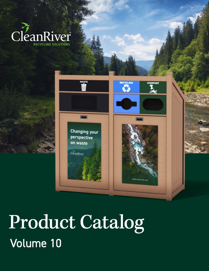
CleanRiver’s recycling stations come with customizable, research-backed signage designed to reduce contamination and improve sorting accuracy at the point of disposal.